In the Spotlight

Our studio is a place that celebrates the stories of your work, love and play.
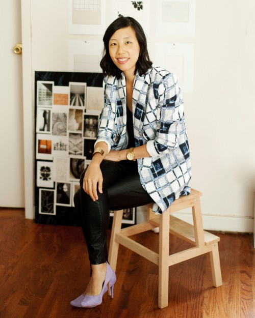
Yuling Designs is a creative design studio based in the heart of New York City. With a made-to-order philosophy, we collaborate with our clients on branding and graphic styling that tells their unique story.
Explore Our Graphics WorkThe signature stationery collections are inspired by some emblematic destinations. Our hope is that these collections will take you on a fanciful journey and inspire you as you plan your special events.
Experience the Collections


